Case Study — Product Design
Learn Marathi
A solo-shipped, full-stack language learning app for travellers seeking cultural connection in Maharashtra — not just vocabulary.
View live site →The Problem
Duolingo doesn’t teach Marathi.
Google Translate handles words. But neither tool helps someone feel cultural context, confidence, or belonging when they visit Maharashtra. 83 million people speak Marathi. The diaspora, heritage speakers, and travellers have almost no structured, culturally intelligent resource to learn it.
“This app isn’t trying to be Duolingo. Google Translate covers translations. This is designed to help people feel cultural connection — not memorize vocabulary.”
Discovery & User Pivot
The user I assumed was not the user I found.
The original PRD was broad — a general Marathi learning platform. As I built, tested, and talked to real people, one user kept showing up with the sharpest need: a traveller visiting Maharashtra, wanting cultural fluency, not a grammar test.
Starting Assumption
Refined Reality
Broad platform for diaspora and heritage speakers. Comprehensive curriculum, script-first, coverage over depth.
A traveller visiting Maharashtra who wants cultural connection — confidence, context, and belonging.
“The PRD I started with looked nothing like what shipped. Every user insight, broken flow, and design iteration changed how I understood the product.”
Design Decisions
Every decision traced back to one user.
With a focused user in mind, design work became about subtraction — removing anything that didn’t serve a traveller who wanted cultural fluency, not fluency scores.
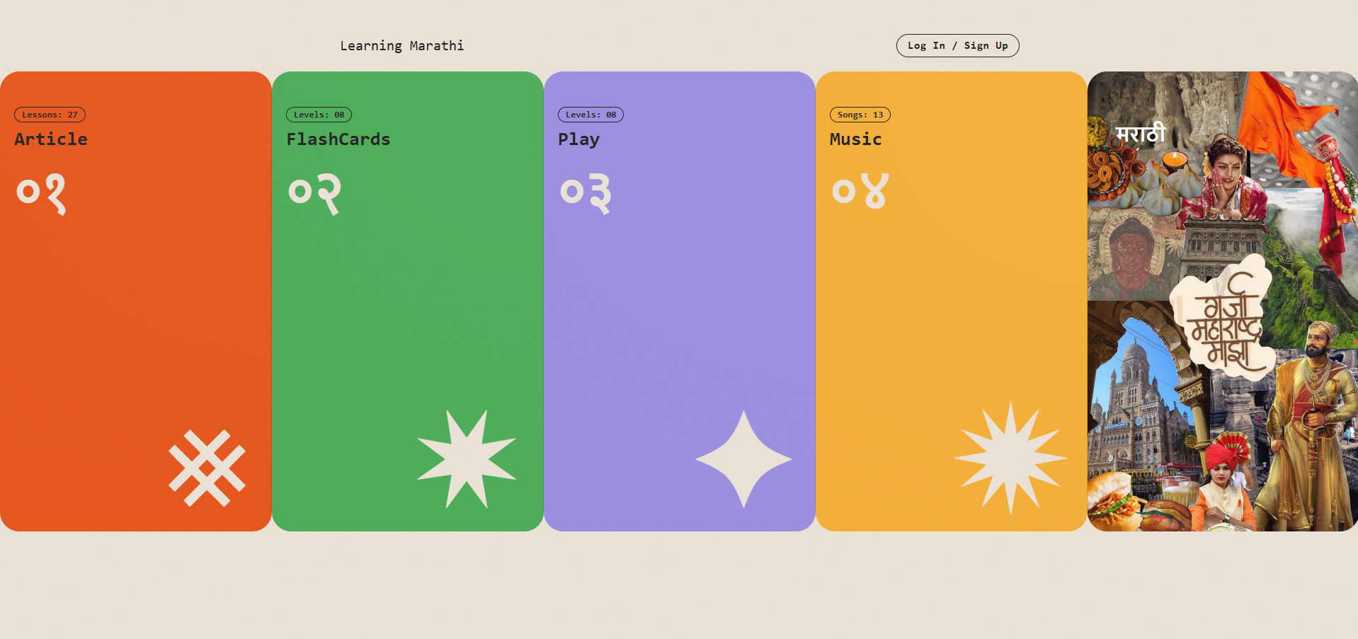
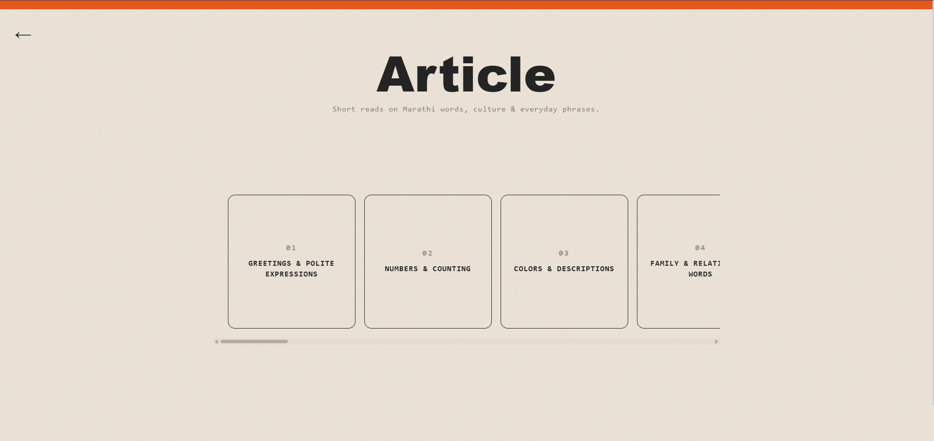
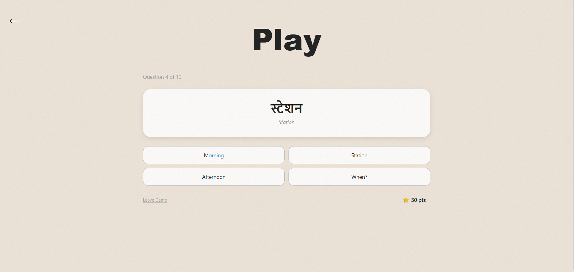
Each mode serves a distinct intent: Devanagari script, spoken phrases, cultural context, and travel scenarios. Depth over breadth.
Learners drop into any lesson without a forced onboarding funnel. Structured, searchable, no mandatory gates.
A complete design system before any production code. Every component designed, documented, and stress-tested for scale.
Hold to reveal transliteration or translation. Encourages immersion while keeping learners safe — especially those unfamiliar with Devanagari.
5–10 task sets with immediate, non-punishing feedback. “Almost — you mixed up two letters” not a red failure screen.
Travellers are on phones. Every screen designed at mobile dimensions first, desktop treated as progressive enhancement.
Technical Ownership
Design informed the build. The build revealed design gaps.
Every layer owned — product direction, UX, frontend architecture, backend security, deployment, DNS configuration, and post-launch iteration. Not a design handoff. A design-build loop.
“AI didn’t replace thinking in this process — it exposed it. Claude Code built what I directed, and the quality of output reflected the quality of my thinking. When thinking was clear, the build moved fast. When it wasn’t, the gaps showed up immediately.”
Outcomes
54
indexed lesson pages
4
learning modes shipped
1
designer, developer, PM
0
external dependencies
What I Learned
User clarity restructures everything.
The most impactful design decision wasn’t a UI choice — it was naming the user precisely. Once the traveller replaced the generic ‘Marathi learner,’ the entire IA, content strategy, and interaction model clarified.
Design and build are not sequential.
Building before design clarity locks in assumptions. Designing without building hides problems until production. The most productive mode was a tight loop — design a component, build it, learn, return to design.
AI amplifies thinking, not replaces it.
The quality of Claude Code’s output directly reflected the quality of upstream design thinking. Vague direction produced vague code. Precise specs produced precise implementations. The tool exposed what I actually knew.