Slack
This smartwatch UI design achieves intuitive navigation and adaptive layouts for enhanced user experience on wearable devices. The project prioritizes clarity and efficient micro-interactions.
CHALLENGE: PROMPT
A challenge to design a UI Kit for Slack a task focused on applying visual design principles to a familiar, real-world product.
The brief was generated by Sharpen, a platform that provides open-ended design challenges to spark creativity, problem-solving, and thoughtful execution.
PROJECT BREAKDOWN
Color Scheme
Primary Colors used
Typography
San Francisco is used for a Watch OS interface, but here Roboto is used.
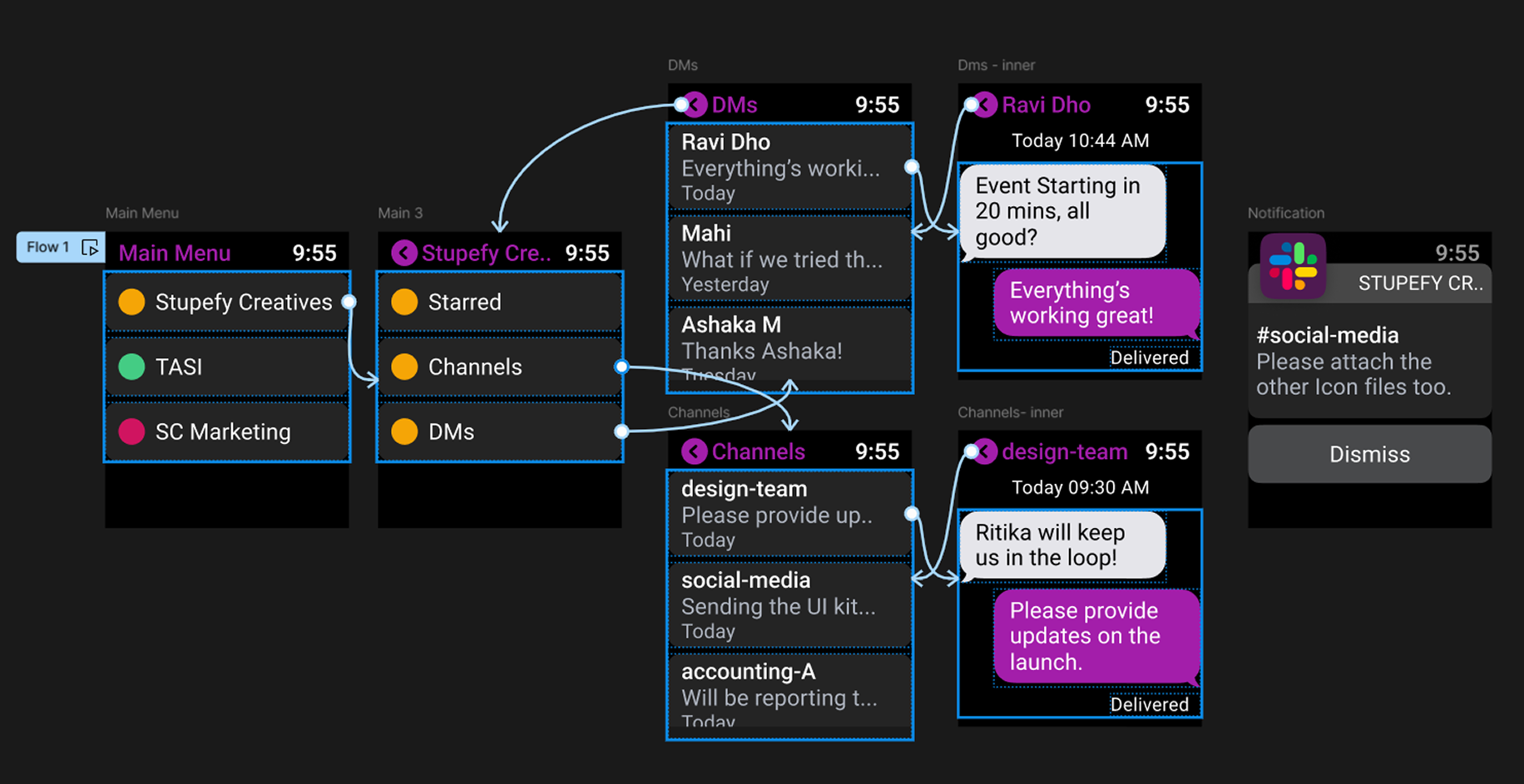
Key Components
Main menu, Channel, DMs, Starred, Message View, Notification.
Guideline Used
Apple's Human Interface Guidelines for Watch OS provided by Figma Community.
Accessibility
Ensuring text is legible with sufficient contrast using Primary & Secondary colors.
UI Patterns
Common use cases for Slack on a smartwatch (quick replies, notifications, checking messages).
Design Process
Research
Analyzed user behaviors, watchOS patterns, and Slack usage contexts
Information Architecture
Mapped features and prioritized critical functions for watch interface
Wireframing
Sketched low-fidelity concepts exploring different navigation patterns
Visual Design
Created high-fidelity screens adhering to watchOS guidelines
Prototyping
Built interactive prototypes to test navigation flows
Iteration
Refined designs based on usability testing and feedback
Main Menu & Navigation
While this is a conceptual design, these are the key metrics that would measure success in a real-world implementation.
PROTOTYPE