Case Study — Brand & Product Design
TASI
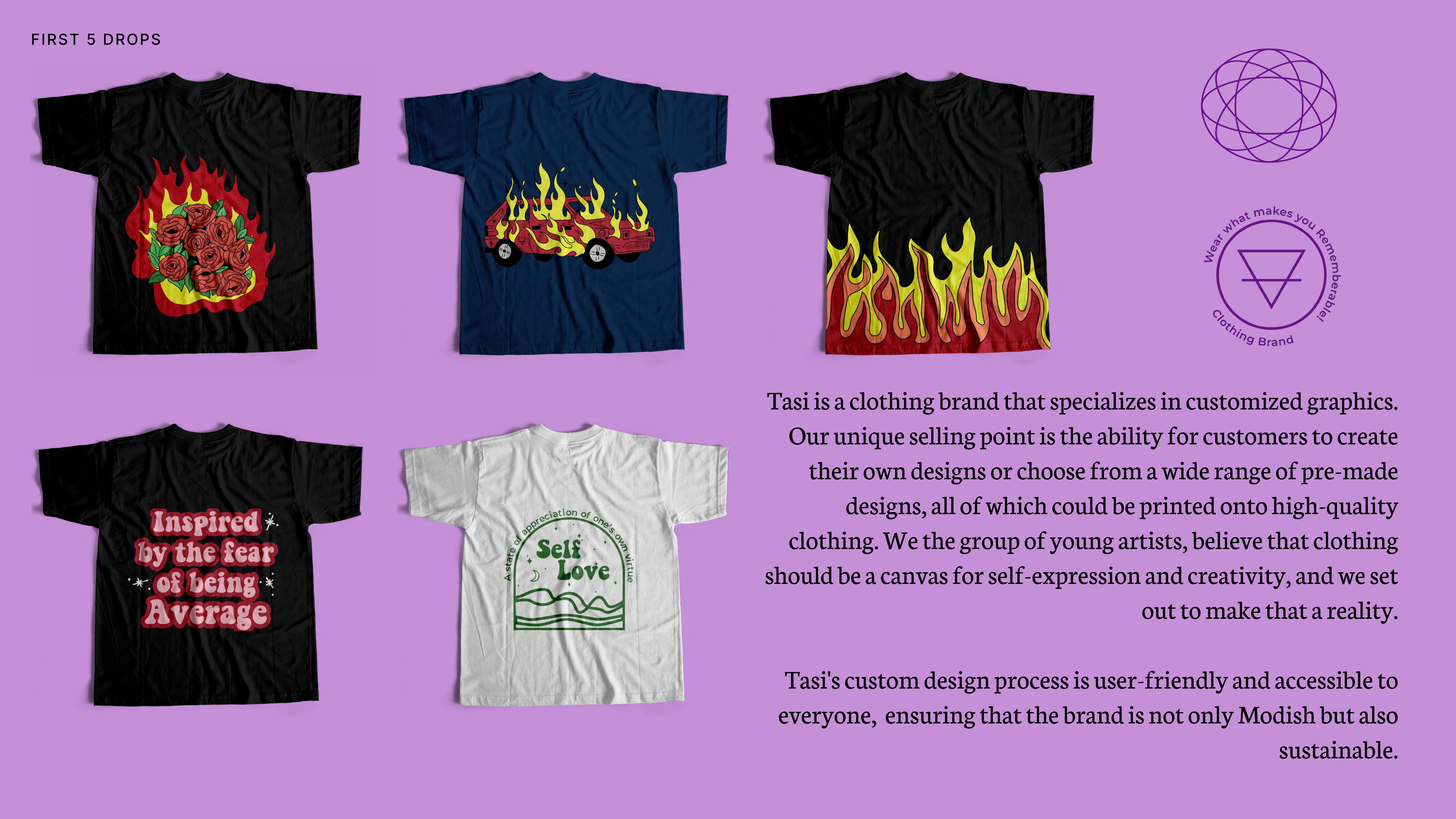
A self-initiated clothing brand exploring customisable graphics as a form of ‘direction’ — a solo effort in brand identity, experience design, and product strategy from concept to launch.
The Problem
Graphic apparel lacks meaning.
The custom clothing market is saturated with generic print-on-demand platforms that treat apparel as a blank canvas for any image. The result is a race to the bottom on price, with no coherent brand narrative or design intent behind what people wear.
The deeper problem: clothing is one of the most visible forms of self-expression humans have — yet most custom apparel tools are built like office printers, not design systems. There was no brand in the market treating custom graphics as a deliberate, narrative-driven design discipline.
“Clothing isn’t just fabric. It’s directional. People use what they wear to signal identity, community, and belief. TASI was built to take that seriously.”
Research
Understanding the gap between expression and execution.
Before designing anything, I mapped the competitive landscape and spoke with potential customers — people who’d either tried custom apparel platforms or wanted to but didn’t know where to start.
Analysed 10+ custom apparel platforms (Printful, Redbubble, Custom Ink). Found: strong on fulfilment, weak on design narrative. None led with concept.
Talked to 8 potential customers across two groups: individuals wanting statement pieces, and small teams wanting branded merch. Both wanted more than a template — they wanted a collaborator.
No brand in the mid-market segment combined a strong conceptual identity with accessible custom graphics. The space was either luxury/bespoke or mass-market/generic. Nothing thoughtful and accessible existed.
The Sanskrit root ‘tasi’ — meaning ‘showing direction by means of a thing’ — became the conceptual anchor. Apparel as directional signal rather than decoration. This reframe shaped everything downstream.
Core Insights
Three insights that shaped every subsequent decision.
The friction wasn’t technical. It was creative. People knew what they wanted to express but didn’t know how to turn it into a design. The product needed to feel like working with a designer, not uploading a file.
TASI’s Sanskrit root gave the brand a conceptual spine — direction through an object. Every design decision (typography, colour, copy tone) became an extension of that idea. Naming isn’t decoration; it’s architecture.
Routing customers to LinkedIn and email instead of a checkout cart was intentional. The goal was qualified conversations, not conversion volume. Over-engineering commerce flows would have buried the brand story before it had a chance to land.
Design Direction
Signal-rich branding. Minimal friction.
The brand system was built around one question: what does ‘direction’ look like as a visual language? The answer was restraint — clean typography, deliberate whitespace, and graphics that communicate without shouting.
Logo and wordmark built on typographic precision — no decorative elements. The name carries the concept; the mark just needs to be clean enough to get out of the way.
A single type family with strong weight contrast. Headlines carry weight; body copy recedes. The hierarchy mirrors the brand’s philosophy: direction, not noise.
Neutral base with one accent. Apparel designs provide visual richness; the brand system stays out of competition with them.
Two sentences for the brand description. One CTA. Every word earns its place. Short copy was a deliberate design decision, not a time constraint — visuals should lead the experience.
Linear: read the concept → browse designs → get in touch. No product filters, no cart, no decision paralysis. Channelling to LinkedIn/email optimised for conversational, qualified leads.
Prototype
Design before build. Always.
The Figma prototype went through three rounds before a single line of production code was written. Each round answered a specific question.
Wireframes testing the IA. Core question: does the linear read → browse → contact flow feel natural, or does it feel like something is missing? Finding: users wanted ‘How it works’ before the CTA.
High-fidelity mock applying typography, spacing, and the first round of graphic design samples. Core question: does the brand feel intentional or generic? Finding: copy was doing too much work. Images needed to lead earlier.
Testing the contact flow. Core question: does routing to LinkedIn and email feel like a feature or a limitation? Finding: when framed correctly (‘commission a design’ not ‘contact me’), it felt exclusive, not lazy.
Technical Decisions
Every constraint was a design decision.
As co-founder and sole designer-developer, technical decisions were inseparable from product decisions. The stack was chosen to move fast without sacrificing design quality.
Deliberately de-scoped. Adding cart, payments, and inventory management would have taken 3× longer and distracted from brand validation. LinkedIn/email CTA was a product decision, not a workaround.
Nesting TASI within the personal portfolio was intentional — it framed the brand as design-led from the first touchpoint, and leveraged existing portfolio traffic for early exposure.
Used SQL-based tracking to monitor which design categories generated the most engagement and which contact touchpoints (LinkedIn vs email) converted better. Data informed the next design iteration.
No third-party plugins or frameworks beyond what was strictly necessary. Fast load, easy to maintain solo, and no moving parts to break between design updates.
Iterations
What changed after launch — and why.
TASI launched as a brand story page. Post-launch conversations and early analytics revealed three things that needed to change.
Early visitors understood the concept but didn’t know the next step. Added a brief 3-step process: briefing → concept options → final print. Contact rate improved immediately.
Most early inquiries were for team or event merch, not personal statement pieces. Reordered the design showcases to lead with corporate/team examples. Aligned copy to speak to that buyer first.
‘Get in touch with me’ was too vague. Changed to ‘Commission a design’ which set clearer expectations and attracted more intentional, qualified leads. Reduced low-context enquiries significantly.
What I Learned
Naming is product strategy.
The Sanskrit root ‘tasi’ wasn’t a branding exercise — it was a strategic anchor. Every downstream decision (IA, copy, visual system, CTA framing) was easier because the concept was precise from the start. Vague brand names produce vague products.
Constraint produces clarity.
Removing the e-commerce stack forced the brand story to carry the entire experience. That constraint made the page better, not weaker. The lesson: scope decisions are design decisions. What you leave out shapes what remains.
Analytics and design are the same loop.
Using SQL to track which designs generated interest and which CTAs converted wasn’t a post-launch add-on — it was built into the product from day one. The analyst instinct and the designer instinct are not in tension. They feed each other.
v1 is a question, not an answer.
TASI’s launch was a hypothesis: does a narrative-driven, collaboration-first model resonate? The answer came through conversations, not conversion metrics. Senior design isn’t about shipping a finished product — it’s about shipping the right question.
What’s Next
The product roadmap — from brand experiment to scaled platform.
Browsable design gallery by category (Minimal, Cultural, Corporate, Loud). Short ‘How it works’ section. Intake form capturing use-case, budget, and timeline.
Light text configurator — preview words and phrases in chosen type styles and placements. Still collaboration-first, but with a self-serve entry point.
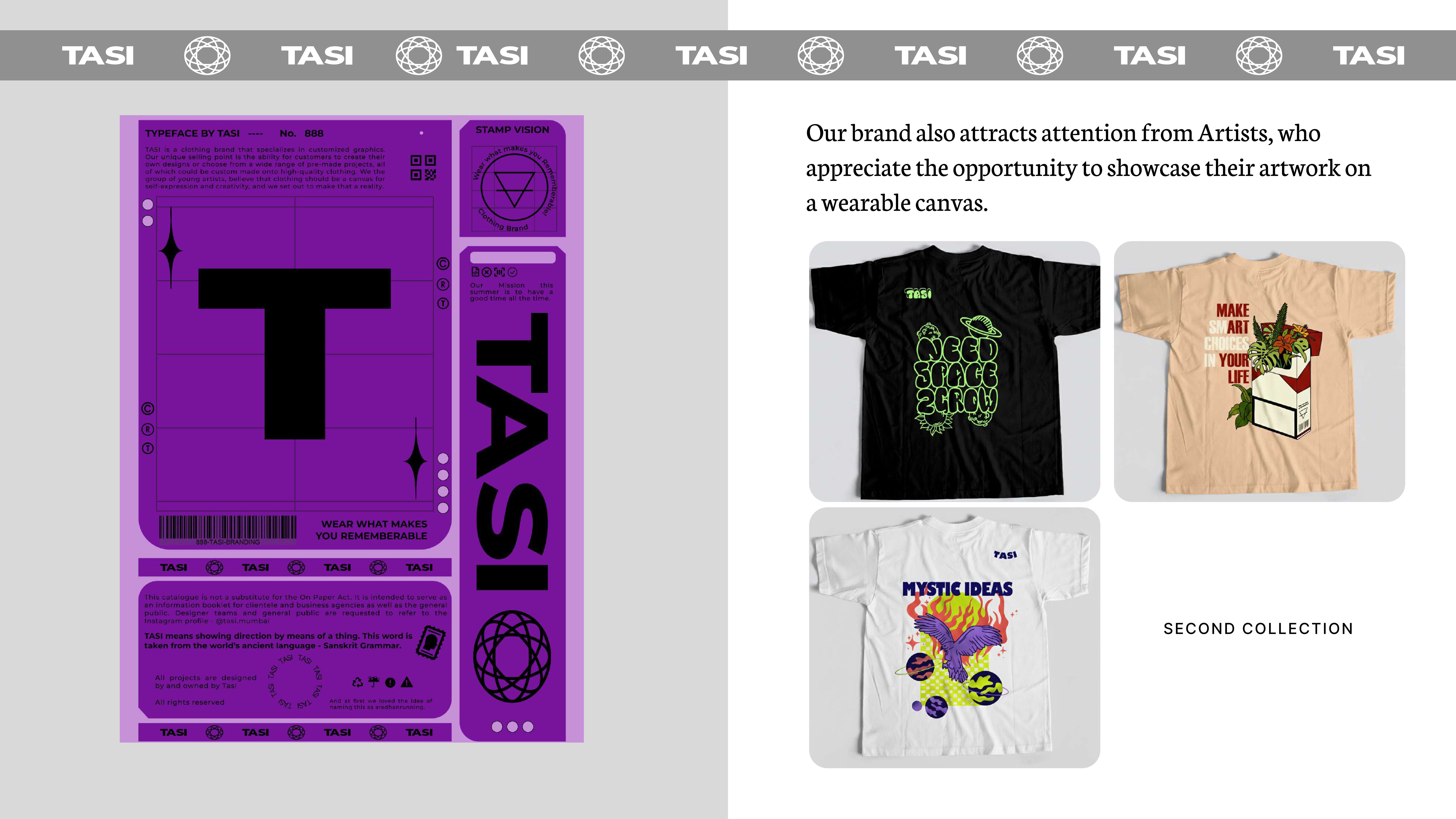
A curated store of best-selling commission designs. Collaboration with illustrators — TASI as a platform for directional, narrative-driven graphics.
Designs
.jpg)
.png)
.png)